
Mandeep Kaur is an honors biochemistry and Spanish major at the University of Arkansas. On campus, you can spot her leading SI sessions for chemistry and conducting research about fibroblast growth factors. Also, if you were in the Honors College on the right day, you might have seen her as the Honors College Dean for a Day. After completing her undergraduate studies, she hopes to go to medical school.
Maps seem truthful enough. They tell where things are in relation to other things. However, even the most basic maps carry some level of distortion. For example, it is impossible to represent a sphere such as the Earth on a two-dimensional plan without some level of distortion. If you have every peeled an orange, and tried to lay it flat, without any gapping, then you understand what I’m talking about.
Hence, any flat map of the Earth cannot be completely accurate. This fact leads to inherent misinformation on any world map since it makes continents that are close to the equator, such as Africa, appear to be smashed and tiny, while continents such as Europe that are further away from the equator appear larger and longer than they actually are. While you may think that it’s just a map, viewing this map over and over again may cause you to subconsciously associate the “smashed” areas as less powerful and the “elongated” areas as more powerful.
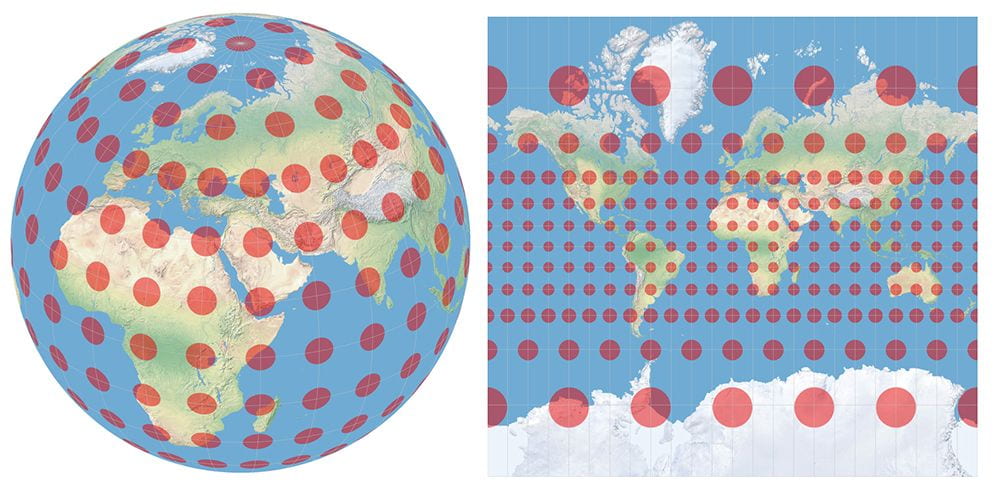
Imagine that a field of circles, all the same size, cover the globe. Here’s how the globe with circles look when flattened into a Mercator map. Visit https://map-projections.net/tissot.php for more information on the Tissot Indicatrix, developed by French mathematician Nicolas Auguste Tissot.
If something as seemingly simple as a world map can lead to potential bias and misinformation, the difficulty only grows when attempting to map a contemporary phenomenon that is still occurring such as the current coronavirus crisis. One of the most popular maps used to map the pandemic is a chloroplast map, which uses color to demonstrate how many different cases that there are in a particular area. For example, the map on the Arkansas Department of Health’s website displays the total number of cases, divided by county, in a chloroplast style.
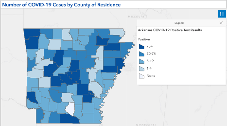
Chlorplast map of Arkansas displaying the number of COVID-19 cases per county. Source: Arkansas Department of Health.
At first, glance, without looking at the total number of cases in each country, it doesn’t look so bad. The shades of blue, while different, are pretty close together so it carries the implication that things must be the same or pretty close together across the state. The darkest blue color represents any county that has more than 75 cases. This means that Lawrence country, which has 82 cases and Lincoln country, which has 975 cases, are the same color. The vast differences of severity between the two counties are not accurately displayed through the chloroplast map. Furthermore, an important story is missing from this map. The large number of cases in Lincoln county is due to an outbreak in the Cummins Prison Unit. This makes it seem that Lincoln county is one of the hotspots in the nation, while in reality most of the cases within that county are isolated within a single prison unit. However, this is only one of the few stories that this map is not able to tell. For example, Cleburne County is a dark blue as well, despite being a rural county, due to an outbreak in a church congregation.
I didn’t think too much about how awful this map was until this course. Being the type of person that I am, I would check the numbers by country first and then maybe take a quick glance at the map. However, if you value the visual, it is scarily easy to develop a misunderstanding, and let the map tell the story for you. The ideal way to avoid misinformation is to have a perfect map, but like most things, perfection is nearly impossible. Instead, it is best to seek out a map that is rich in data and is well designed However, even if you find an objectively “good” map, the best way to use a map is to remember the orange and let the map guide, not control, your interpretation.